Let’s run some clustering algorithms! We are still going to use the Iris data, because we are super familiar with it already. Loading it works the exactly in the same way; I will not repeat the notes but just copy the code and description from before here for your reference
Iris Dataset
Let’s load the Iris dataset! Begin by importing the load_iris tool from sklearn. This is an easy loader scheme for the iris dataset.
from sklearn.datasets import load_iris
Then, we simply execute the following to load the data.
x,y = load_iris(return_X_y=True)
We use the return_X_y argument here so that, instead of dumping a large CSV, we get the neat-cleaned input and output values.
k-means clustering
The basics of k-means clustering works exactly the same as before, except this time we have to specify and get a few more parameters. Let’s begin by importing k-means and getting some clusters together!
from sklearn.cluster import KMeans
Let’s instantiate the KMeans cluster with 3 clusters, which is the number of classes there is.
kmeans = KMeans(n_clusters=3)
kmeans = kmeans.fit(x)
Great! Let’s take a look at how it sorted all of our samples
kmeans.labels_
| 1 | 1 | 1 | 1 | 1 | 1 | 1 | 1 | 1 | 1 | 1 | 1 | 1 | 1 | 1 | 1 | 1 | 1 | 1 | 1 | 1 | 1 | 1 | 1 | 1 | 1 | 1 | 1 | 1 | 1 | 1 | 1 | 1 | 1 | 1 | 1 | 1 | 1 | 1 | 1 | 1 | 1 | 1 | 1 | 1 | 1 | 1 | 1 | 1 | 1 | 0 | 0 | 2 | 0 | 0 | 0 | 0 | 0 | 0 | 0 | 0 | 0 | 0 | 0 | 0 | 0 | 0 | 0 | 0 | 0 | 0 | 0 | 0 | 0 | 0 | 0 | 0 | 2 | 0 | 0 | 0 | 0 | 0 | 0 | 0 | 0 | 0 | 0 | 0 | 0 | 0 | 0 | 0 | 0 | 0 | 0 | 0 | 0 | 0 | 0 | 2 | 0 | 2 | 2 | 2 | 2 | 0 | 2 | 2 | 2 | 2 | 2 | 2 | 0 | 0 | 2 | 2 | 2 | 2 | 0 | 2 | 0 | 2 | 0 | 2 | 2 | 0 | 0 | 2 | 2 | 2 | 2 | 2 | 0 | 2 | 2 | 2 | 2 | 0 | 2 | 2 | 2 | 0 | 2 | 2 | 2 | 0 | 2 | 2 | 0 |
Let’s plot our results.
import matplotlib.pyplot as plt
We then need to define some colours.
colors=["red", "green", "blue"]
Recall from yesterday that we realized that inner Septal/Pedal differences are not as variable as intra Septal/Pedal differences. So, we will plot the first and third columns next to each other, and use labels_ for coloring.
# for each element
for indx, element in enumerate(x):
    # add a scatter point
    plt.scatter(element[0], element[1], color=colors[kmeans.labels_[indx]])
# save our figure
plt.savefig("scatter.png")
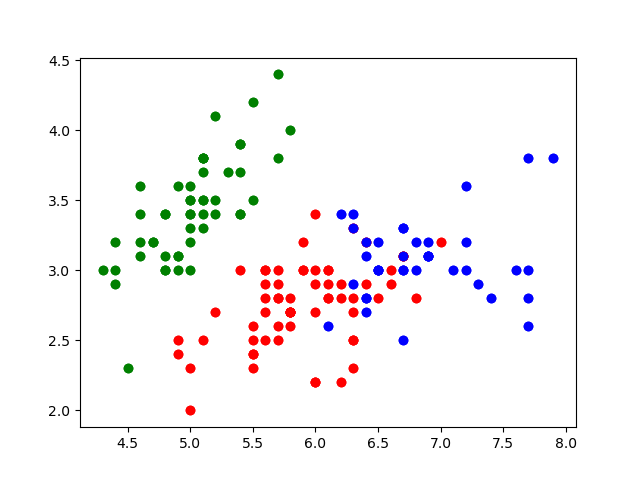
Nice. These look like the main groups are captured!
Let’s compare that to intended classes
y
| 0 | 0 | 0 | 0 | 0 | 0 | 0 | 0 | 0 | 0 | 0 | 0 | 0 | 0 | 0 | 0 | 0 | 0 | 0 | 0 | 0 | 0 | 0 | 0 | 0 | 0 | 0 | 0 | 0 | 0 | 0 | 0 | 0 | 0 | 0 | 0 | 0 | 0 | 0 | 0 | 0 | 0 | 0 | 0 | 0 | 0 | 0 | 0 | 0 | 0 | 1 | 1 | 1 | 1 | 1 | 1 | 1 | 1 | 1 | 1 | 1 | 1 | 1 | 1 | 1 | 1 | 1 | 1 | 1 | 1 | 1 | 1 | 1 | 1 | 1 | 1 | 1 | 1 | 1 | 1 | 1 | 1 | 1 | 1 | 1 | 1 | 1 | 1 | 1 | 1 | 1 | 1 | 1 | 1 | 1 | 1 | 1 | 1 | 1 | 1 | 2 | 2 | 2 | 2 | 2 | 2 | 2 | 2 | 2 | 2 | 2 | 2 | 2 | 2 | 2 | 2 | 2 | 2 | 2 | 2 | 2 | 2 | 2 | 2 | 2 | 2 | 2 | 2 | 2 | 2 | 2 | 2 | 2 | 2 | 2 | 2 | 2 | 2 | 2 | 2 | 2 | 2 | 2 | 2 | 2 | 2 | 2 | 2 | 2 | 2 |
There are obviously some clustering mistakes. Woah! Without prompting with answers, our model was able to figure out much of the general clusters at which our data exists. Nice.
We can also see the “average”/“center” for each of the clusters:
kmeans.cluster_centers_
| 5.9016129 | 2.7483871 | 4.39354839 | 1.43387097 |
|---|---|---|---|
| 5.006 | 3.428 | 1.462 | 0.246 |
| 6.85 | 3.07368421 | 5.74210526 | 2.07105263 |
Nice! These are what our model thinks are the centers of each group.
Principle Component Analysis
Let’s try reducing the dimentionality of our data by one, so that we only have three dimensions. We do this, by, again, begin importing PCA.
from sklearn.decomposition import PCA
When we are instantiating, we need to create a PCA instance with a keyword n_components, which is the number of dimensions (“component vectors”) we want to keep.
pca = PCA(n_components=3)
Great, let’s fit our data to this PCA.
pca.fit(x)
Wonderful. singular_values_ is how we can get out of the PCA’d change of basis results:
cob = pca.components_
cob
| 0.36138659 | -0.08452251 | 0.85667061 | 0.3582892 |
|---|---|---|---|
| 0.65658877 | 0.73016143 | -0.17337266 | -0.07548102 |
| -0.58202985 | 0.59791083 | 0.07623608 | 0.54583143 |
So, we can then take a change of basis matrix and apply it to some samples!
cob@(x[0])
| 2.81823951 | 5.64634982 | -0.65976754 |
What’s @? Well… Unfortunately, Python has different operator for matrix-operations (“dot”); otherwise, it will perform element-wise operations.
We can actually also see the \(R^2\) values on each of the axis: the variance explained by each of the dimensions.
pca.explained_variance_
| 4.22824171 | 0.24267075 | 0.0782095 |
Nice! As you can see, much of the variance is contained in our first dimension here.